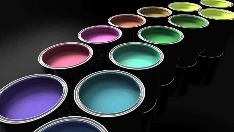
Choosing the right interior paint color combination can be an agonizing decision. Not only is painting a room a time-consuming project, it’s also expensive. A basic knowledge of the color wheel and color theory will help you to understand why some colors look better together than others, so that you can make wise color choices for the walls and subsequently, the rest of the room.
The color wheel begins with the primary colors (red, yellow and blue). The primary colors are combined to make all other colors. The secondary colors (orange, green, purple) are each mixed by combining two primary colors. Tertiary colors are formed by mixing one secondary color with one primary color. Many successful color combinations are made up of colors on the color wheel that bear a relationship to one another.
Complementary Color Pairs
Colors found opposite one another on the color wheel are called complementary colors. Complementary color pairs are high contrast. These colors are often said to be “opposites”, much like black and white are said to be opposites. Red and green, purple and gold, and orange and blue are all complementary color pairs. These colors, when placed together in one room, create dramatic, sophisticated color schemes. Usually, one color is chosen to be the dominant color. Various shades of the dominant color are placed around the room and painted on the walls, while the accent color (or, non-dominant color) is used in small amounts.
Because complementary color pairs tend to be very bright and loud, earthier versions of these colors are used in most in interior design. For example, a room that uses an orange and blue color scheme might be made up of mostly gray-blues, with copper accents. The walls of the room will be painted entirely in shades of gray blue, or the blue may be broken up by a single horizontal stripe of copper near the ceiling.
Analogous Color Schemes
Colors found side by side on the color wheel are called analogous colors. Red and orange, green and blue, yellow and green are all analogous color pairs. Analogous colors are relatively low-contrast. These color pairs have a unifying effect when used in interior design. In fact, analogous color pairs are often combined with a neutral like white, cream or gray, in order to break up the colors and prevent them from becoming overwhelming.
When analogous colors are used in interior design, the brighter, more saturated versions of these colors are often used to prevent the color schemes from seeming uninspired, uninteresting or dull. For example, a kitchen might be painted in shades of tomato red and tangerine orange. The intense color of the walls may then be broken up with gleaming white counters, cabinets and floors.
Natural Color Combinations
Colors seen together in the outside environment are perceived by people as having a natural relationship that makes them pleasing to the eye. In addition, these colors usually have a relationship that can be pinpointed on the color wheel. For example, the colors of a Caribbean beach (very light yellow sand, turquoise-blue water) are near complements. There are an endless number of gorgeous color schemes in any given natural environment, and even in foods like fruits and vegetables.
A classic example, often used in interior design with beautiful results, is the eggplant color scheme. Deep rich purple, light grassy green and creamy khaki are frequently used with success in modern homes. In a smaller room, khaki walls with accents of light purple and green are appropriate, while larger rooms may look best if they are dominated by the darker colors.
Painting Walls Two Or More Colors
Although many people simply choose one single color to paint their walls, it is becoming increasingly common to paint a room with two or three colors. There are many different ways this can be done. One method is to reserve a single wall as an “accent” wall. An accent wall is a wall that has been painted a color different from the other three walls in the room. Sometimes accent walls are dramatically different in color, other times they are only subtly different. A high contrast accent wall adds drama to a room and provides a focal point. A low contrast accent wall may not even be consciously noticed by people in the room. Low contrast accent walls serve to create a dynamic visual flow while reinforcing a color scheme.
In rooms with unusual wall structures, like built-in shelving, the majority of the room may be painted in a single color, leaving the shelving to be painted in the other colors of the color scheme.
Patterns like stripes are a more obvious way to display of multiple colors on a wall, but this daring approach is still fairly uncommon and probably not for everyone. However, a single band of horizontal color painted all the way around the room will establish your color scheme without the high-impact results of a full pattern of stripes.
If you’re having a hard time finding the right interior paint color combination, many stores that sell paint can provide catalogs and books with photographs of attractive color schemes. Picking a theme will help as well, since many themes have built-in color schemes (for example, a red white and blue combination for an Americana themed room). Remember that different color combinations are appropriate for different rooms. Color schemes dominated by darker colors should be limited to larger rooms, and lighter, calmer color combinations are appropriate for smaller rooms. Formal spaces in the home, like the living room and dining room, benefit from color combinations that involve neutral and earthy colors. Brighter, bolder combinations are more appropriate in bedrooms, bathrooms and kitchens. In this way, the colors help to reinforce the purpose of the room and the interactions of people who occupy it.

